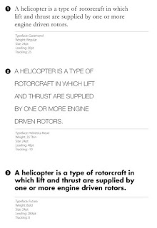
The choice of typefaces and technique of setting type give compositions their character, style, and pace. Besides making the text more legible, the correct typography helps the viewer understand the subject of the design.
Notice how typography can define and alter the message by looking at the same text with different typefaces:
BASIC TYPOGRAPHY TERMS AND CONCEPTS:
LINES: A line of characters has at least five lines that it can be aligned to. These horizontal lines are guides for capital letters, ascenders, lowercase and descenders.
Below are examples of these five lines:
- Cap height (or cap line): the cap height or cap line marks the top of the capital letters
- Ascender height (or topline): the ascender height or top line shows where the top of letters such as k and h touch and, in a lot of cases, this line is slightly higher than the capital line, which means that capital letters are NOT the tallest letters in text
- Midline (or x-height): the midline or x-height shows the height of the lowercase letters (excluding ascenders and descenders) and is typically measured using the height of the letter x
- Descender height (or beardline): the descenders are the parts of characters that go below the baseline (such as the letters p and y) and the descender height or beardline shows where the bottoms of the decenders are located
LEADING (pronounced led-ding): Leading is the amount of space between the lines of text and can be measured by obtaining the distance between two baselines - in CSS, such as in building websites, leading is called line-height
Leading can affect whether or not long blocks of text are easily readable.
- when leading is decreased, the lines get closer to each other and make a block of text appear more compacted or squished together
- when the amount of leading is lowered, it can cause descenders and ascenders to collide, and this could it difficult to read the text, however, as a visual style, low amounts of leading can increase the pace of the reader and invoke the feeling of cramped conditions and claustrophobia, which can sometimes be desirable
- increasing the leading can reduce the pace of a piece of text and slow the reader because there is more white space and relay a more relaxed feel in the text blocks
- too much leading can cause reading problems, as the eyes of the reader is required to travel a greater distance between lines of text.
In the examples below, all are set in the same typeface, weight and measure, but each one has been given different leading values:


