Monday, March 30, 2020

Assignment 04 - Linear Perspective Design

Create two (2) linear perspective illustrations using Adobe Illustrator

- make each poster size (24 inches wide by 18 inches high)
- use Adobe Illustrator's Perspective Grid Tool - note that the Perspective Grid Tool icon will be active in the upper left hand corner of your artboard  (see below)


- click on the links below to see tutorials on using the Perspective Grid Tool:  

https://helpx.adobe.com/illustrator/using/perspective-grid.html 

AND

https://helpx.adobe.com/illustrator/using/perspective-drawing.html

ASSIGNMENT EXAMPLES:


LINEAR PERSPECTIVE - A TUTORIAL:
Linear perspective is one of the ways to create the illusion of space on a two-dimensional surface. Linear perspective is a method using lines to create the illusion of space on a 2D surface.  All forms of linear perspective involve the horizon line, vanishing point(s), and lines of perspective that recede or advance to the vanishing point(s).
Each form of linear perspective is named for the number of vanishing points used in the drawing. There are three types of linear perspective.  One point perspective uses one vanishing point placed on the horizon line.  Two point perspective uses two points placed on the horizon line. Three point perspective uses three vanishing points. (see below)


Two point perspective starts by defining the horizon line.  This line theoretically represents the line that divides the sky from the ground.  However, with many perspective drawings, this line is implied and instead represents the eye-line or "line of sight" of the viewer.  (see below)


Once the horizon line has been established, the vanishing points are placed.  The vanishing point is defined as a point placed on the horizon line where objects begin to disappear because of distance.  A good way to think of the vanishing point is by imagining yourself standing on a beach. Looking both directions, you can see endlessly down the beach. At some point, people on the beach walking away from you will become progressively smaller until they completely disappear at the horizon line. 

With two point perspective, two vanishing points are placed on the horizon line.  These two points should be spaced out from each other to prevent distortion.  Both vanishing points need not both be within the picture plane, just as long as they are found on the horizon line, which continues on, leading off of the picture plane in both directions.
The next step is to draw the corner of the object.  Most commonly, two point perspective is used for drawing buildings or interiors, so this line could be the corner of a building. This line is drawn in between the two vanishing points and can cross over the horizon line. (see below)
Receding lines are next drawn from each end of the corner to each one of the vanishing points.  These lines are called orthogonal lines. Any set of parallel lines that recede away from the viewer will follow along these lines to one of the vanishing points.  (see below)


Parallel, vertical lines are drawn to indicate where the building or form ends. The closer that these lines are placed in space to the vanishing points on either side, the longer the form appears.
When a form is placed so that it overlaps the horizon, no additional lines are needed to define the overall form of the object.

However, it is important to note that additional lines do exist. These lines are visible when the subject is placed above the horizon line or below it.  (see below)


Orthogonals extend out from each end of the form and line up with the opposite vanishing point. The location of intersection that occurs defines the the back corner of the cube, which is drawn using a vertical line.  (see below)

For forms placed below the horizon line the steps remain the same. However, the top of the form will be visible. This means that the top portion of the form will be defined by the orthogonal lines that extend from each end to the opposite vanishing point.  (see below)

  Here again, some of the lines are not visible in the finished drawing (red lines). It is important to note that the locations of where these lines intersect define the back corner of the cube.  (see below)


For forms placed above the horizon line, the same steps are followed. In this case, the bottom portion of the form is now visible to the viewer. The bottom portion is defined by extending lines from each end of the cube to the opposite vanishing point.  (see below)


As is the case with the other examples, additional lines (red lines) exist but are not visible in the finished drawing. When complete, all lines that are no longer needed can be erased revealing the illusion of 3D forms in space.  (see below)


Additional details can be added to a scene to create limitless possibilities. Vertical lines are drawn to indicate edges and corners, while orthogonal lines are drawn for parallel edges that recede into space.  (see below)


Assignment 05 - Mondrian-Inspired Posters

Using Adobe Illustrator, create three (3) posters with colors and design inspired by Piet Mondrian:

- create each poster at 18 inches by 18 inches, if square, and 18 inches by 24 inches, if rectangular

- when completed, save each poster as an .ai file and also Export it as a JPEG to post on your blog


1.) Research the triadic paintings of Piet Mondrian that he created using primary colors and choose a painting to replicate using Adobe Illustrator


 (above) Piet Mondrian, Composition A, 1923

2.) Create a second triadic poster in the Mondrian style using triadic secondary colors


3.) Create a third poster in the Mondrian style using three analogous colors that incorporate intermediate or tertiary colors; you may also use primary and secondary colors


All three posters should be of a different design from the other posters

Assignment 03 - Complementary Colors

Complementary Colors


Colors that are opposite each other on the color wheel are considered to be complementary colors, for example:
 - red and green
 - blue and orange
 - yellow and violet
The high contrast of complementary colors creates a vibrant and jarring look, especially when used at full saturation.


The painting displayed below was created by Claude Monet in 1872, and titled Impression, soleil levant (Impression: Sunrise), is the painting that gave its name to the Impressionism style and artistic movement. It is also an example of the utilization of complementary colors as the orange colors in the sky and sun are offset by the blue colors in the boats, and water.


Keith Haring was an American artist and social activist known for his illustrative depictions of figures and symbols. Born on May 4, 1958, in Reading, PA, he grew up in neighboring Kutztown, where he was inspired to draw from an early age by Walt Disney cartoons and his father who was an amateur cartoonist.
 His white chalk drawings could often been found on the blank poster marquees in New York’s public spaces and subways. “I don't think art is propaganda,” he once stated. “It should be something that liberates the soul, provokes the imagination and encourages people to go further. It celebrates humanity instead of manipulating it.” Note Haring's use of complementary colors in his painting "Radiant Baby" shown below:


Born on August 6, 1928, in Pittsburgh, Pennsylvania, Andy Warhol was the most successful and highly paid commercial illustrator in New York even before he began to make art destined for galleries. His screenprinted images of Marilyn Monroe, soup cans, and sensational newspaper stories, quickly became synonymous with Pop art.


ASSIGNMENT (3 parts):
Part I - create an Adobe Illustrator poster with 2 columns and 3 rows of squares with opposing shapes (2 circles, 2 triangles, 2 stars) inside the squares that illustrate complementary colors


Part II -  create a freehand Adobe Illustrator poster in the style of Keith Haring using complementary colors and the pen tablet (if you have access to one, otherwise use your mouse)


Part III - create an Adobe Illustrator poster with four panels of identical minimalist portraits in the style of Andy Warhol’s screenprints using different complementary colors in each panel


Assignment 08 - Typography Part I

As a simple description, typography is the arrangement of type, but how typography is used in a design is deeply rooted in its overall theme, tone and message. It works within the layout, grid and color choice to create a well-thought-out and well-rounded design.

The choice of typefaces and technique of setting type give compositions their character, style, and pace. Besides making the text more legible, the correct typography helps the viewer understand the subject of the design.

Notice how typography can define and alter the message by looking at the same text with different typefaces:


BASIC TYPOGRAPHY TERMS AND CONCEPTS:

LINES: A line of characters has at least five lines that it can be aligned to. These horizontal lines are guides for capital letters, ascenders, lowercase and descenders.

Below are examples of these five lines:

 - Baseline: the line you may be most familiar with is the baseline - the line that the text sits on
 - Cap height (or cap line): the cap height or cap line marks the top of the capital letters
 - Ascender height (or topline): the ascender height or top line shows where the top of letters such as k and h touch and, in a lot of cases, this line is slightly higher than the capital line, which means that capital letters are NOT the tallest letters in text
 - Midline (or x-height): the midline or x-height shows the height of the lowercase letters (excluding ascenders and descenders) and is typically measured using the height of the letter x
 - Descender height (or beardline): the descenders are the parts of characters that go below the baseline (such as the letters p and y) and the descender height or beardline shows where the bottoms of the decenders are located

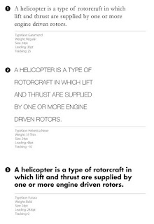
LEADING (pronounced led-ding): Leading is the amount of space between the lines of text and can be measured by obtaining the distance between two baselines - in CSS, such as in building websites, leading is called line-height

Leading can affect whether or not long blocks of text are easily readable.

 - when leading is decreased, the lines get closer to each other and make a block of text appear more compacted or squished together
 -  when the amount of leading is lowered, it can cause descenders and ascenders to collide, and this could it difficult to read the text, however, as a visual style, low amounts of leading can increase the pace of the reader and invoke the feeling of cramped conditions and claustrophobia, which can sometimes be desirable
 - increasing the leading can reduce the pace of a piece of text and slow the reader because there is more white space and relay a more relaxed feel in the text blocks
 - too much leading can cause reading problems, as the eyes of the reader is required to travel a greater distance between lines of text.

In the examples below, all are set in the same typeface, weight and measure, but each one has been given different leading values:


Monday, March 23, 2020

Assignment 07 - Part II - Simple Design Can Be Difficult

This assignment is based upon the principles discussed in Part I of Simple Design Can Be Difficult
link: https://thomaspaineisdead.blogspot.com/2020/03/assignment-07-part-i-simple-design-can.html

The design elements in these assignments are to be created using Adobe Illustrator. The parameters are as follows:

Part A.) Three Rectangles Plus One Red Square

- arrange four squares (three black squares and one red) to create a dynamic composition
- you need NOT show the entire rectangle shapes
- you must show the entire red square
- the red square must not dominate
- use the rectangle and stroke tools appropriately
- size: 7 inches x 7 inches @ 300 p.p.i.
- create a 1" grey border around the perimeter
- refine craftsmanship
- create TWO of these and post them to your blog


Part B.) Four Black Equilateral Triangles

Definition - equilateral triangle: in geometry, an equilateral triangle is a triangle in which all three sides are equal. In Euclidean geometry, an equilateral triangle is also equiangular; that is, all three internal angles are also congruent to each other and are each 60°

- arrange four equilateral triangles to create a dynamic composition
- you need NOT show the entire triangle shapes
- one triangle must dominate
- all triangles must be black in color 
- use the polygon and stroke tools appropriately
- size: 7 inches x 7 inches @ 300 p.p.i.
- create a 1" grey border around the perimeter
- refine craftsmanship
- create ONE of these and post it to your blog

 
Part C.) Three Black and One Red Equilateral Triangles

- arrange four equilateral triangles to create a dynamic composition
- you need NOT show the entire triangle shapes
- three triangles must be black in color
- one triangle must be red in color and can NOT dominate
- use the polygon and stroke tools appropriately
- size: 7 inches x 7 inches @ 300 p.p.i.
- create a 1" grey border around the perimeter
- refine craftsmanship
- create ONE of these and post it to your blog

Assignment 07 - Part I - Simple Design Can Be Difficult

Simple Design Can Be Difficult:
You can’t emphasize everything. It defeats the point. When you try to do that, all of your design elements compete for attention and nothing stands out. They’re all yelling at the same time. Everything is louder, but still nothing is heard.

Emphasis is relative. For one element to stand out, another has to serve as the background from which the first is to stand out. Some elements need to dominate others in order for your design to display any sort of visual hierarchy.

Dominance:
Compare any two elements in a design. Either the elements will be equal in every way or one will exert some level of dominance over the other. The more dominant element will attract the eye and get noticed first. It might even appear to exhibit some sort of control over the less dominant element.
The more dominant element likely has greater visual weight than the elements it dominates. It will seem to exert force on what’s around it.


In the above illustration, the circle is dominant because of its size...

As you develop a composition, you’ll see numerous elements exerting dominance over each other. Some elements will dominate, and some will be subordinate.

How to Establish Dominance:
You design one element to have more dominance than another by giving it more visual weight. The greater its visual weight, the more an element will attract the eye and exhibit dominance.
You create dominance through contrast, emphasis and relative visual weight. Identical items can’t dominate each other. To exert dominance, an element has to look different from the elements it’s meant to dominate.

Your goal is to create elements with noticeable differences in visual weight.

You can vary the same characteristics that we talked about in previous class sessions. As a reminder, here are the most common characteristics you can vary to set different visual weights:
  • size,
  • shape,
  • color,
  • value,
  • depth,
  • texture,
  • density,
  • saturation,
  • orientation,
  • local white space,
  • intrinsic interest,
  • perceived physical weight,
You can create dominance through visual direction as well. For example, you might surround an element with arrows all pointing to that element. If there are enough directional cues, the element could become dominant even if it’s of lesser visual weight than other elements on the page.

You can also have co-dominance, where two dominant elements exist within a composition. However, both will compete for attention and could ultimately be distracting without the right overall balance in your competition.

Ideally, you want a single dominant element.

Dominant Element:
The dominant element in a design is the one with the greatest visual weight. It is the element that attracts the eye first, more than anything else on the page.

Be careful not to make the element so dominant that it completely obscures everything else, but do make it stand out in the design.

Your dominant element is the starting point for the story you’re telling. It’s the entry point into your design. It should attract viewers to the first place you want them to look.

Focal Point:
Focal points are also elements or areas of dominance, just not to the same degree as your one dominant element, which could be defined as your most dominant focal point. Focal points are areas of interest, emphasis or difference within a composition that capture and hold the viewer’s attention.
The focal points in your design should stand out but should be noticed after the element with the most dominance. The graphic below shows a lone circle amid a sea of mostly gray squares. The circle is not only a different shape, but is larger and bright red. It’s likely the first thing your eye notices in the graphic.

Three of the four squares are also reddish in color, though not as bright as the circle. They’re the same size as the other squares in the image, but they do stand out from the gray squares due to their color.

The circle and the three reddish squares are all focal points because they stand out from the majority of other elements in the graphic. They contrast with the mass of gray squares. The large bright red circle stands out the most. It’s the dominant focal point, or the dominant element in this image.


As with the dominant element, you can create focal points by giving them more visual weight than everything except the dominant element — which, again, is your most dominant focal point. You can also create visual direction that leads to different focal points.

Contrast is a good way to create focal points, because contrast calls attention to itself for being different. Anything that can be contrasted and anything that can affect visual weight or direction can be used to create a focal point, in the same way that it can be used to create a dominant element. The difference is simply of degree.

Levels of Dominance:
If you create focal points and make one of those points the dominant element, then you’re starting to create different levels of dominance. The dominant element will sit on one level and will be noticed before all others. The remaining focal points will sit on another level. How many levels of dominance can you realistically have in a design?

Three is a good number. As a general rule, people can perceive three levels of dominance. They notice what’s most dominant, what’s least dominant and then everything else. There needs to be enough difference between these levels for people to distinguish one from the next. You want to create distinct levels, not a continuum.

You could create more than three levels of dominance, but each additional level will reduce the contrast between neighboring levels. Unless you’re sure you can contrast each level well enough, stick with three.
  • Dominant. This is the level with the most visual weight and the one that gets the most emphasis. Your dominant level will usually consist of a single element in the foreground.
  • Sub-dominant. This is the level of focal points, with the exception of the dominant element or dominant focal point. It gets secondary emphasis. Elements on this level get less emphasis than the dominant level but more than the subordinate level.
  • Subordinate. This is this level with the least visual weight. It should recede into background to some degree. This level will usually contain your body of text.
It’s possible for different people to look at a composition and think that different elements are focal points or even the dominant element. Remember to go big enough with your differences in visual weight to make clear which level is more dominant. You want your dominant element and focal points to be as obvious as possible.

Summary:
You can’t emphasize everything. In order for some elements in a design to stand out, other elements must fade into the background.

By varying the visual weight of some elements and the visual direction of others, you can establish different levels of dominance. Three levels of dominance is ideal as that's all that most people can discern.

On one level will sit your dominant element. It’s an entry point into your design, and it should be or be near the most important information on the page.

A second level of focal points can draw attention to the next most important information visitors should see.

Your third level holds everything else. Most of your content will be on this level.
 
Designing different levels of emphasis or dominance will create a visual hierarchy in your design, with more important information being more visually prominent. It will help you communicate with visitors quickly and efficiently.


Monday, March 9, 2020

Assignment 06 - Propaganda Poster

Propaganda Posters Design

1.) choose TWO (2) ideas, concepts, or themes to promote using a poster as your form of communication - ONE poster MUST feature a person or part of a person (hand, arm, leg, etc.)


2.) determine your audience (based upon age, finance, education, political party, etc.) and create your poster based upon that particular audience

3.) create these posters at 12" x 18" that are designed to communicate that idea, concept, theme, or item to that specific audience, making sure that one poster is mostly weighted for negative space and the other poster is mostly weighted for positive space

4.) determine the color palette (using a limited color palette of no more than 5 colors) and either draw your own person (or part of a person, such as an arm or hands) or select a photograph and use Image Trace in Illustrator to “posterize” the photo

5.) select a font with the appropriate size and weight for your message (you may download a specific font from the web and it SHOULD install on your school computer)
 - NOTE: I like to use www.dafont.com to search for new and interesting FREE fonts

6.) determine the text based upon your message - it should short in the number of words, easy to quickly understand, and the text should be large enough to read quickly at a distance (try to reduce your message to 3-6 words) - use type effects to create embossed, textured, 3D, and other stylized text features

7.) create your posters using Adobe Illustrator, Adobe Photoshop, or a combination of both - you will find that Illustrator gives you more creativity with text

SEE THE IMAGES BELOW FOR IDEAS: